
Development
Figma Design Tokens to CSS: 2026 Production Guide
·10 min read
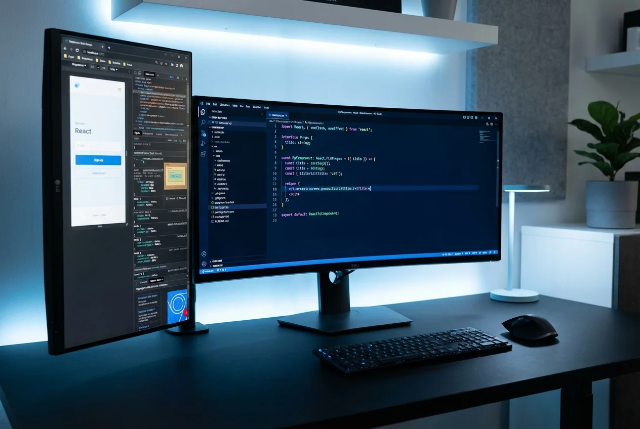
Most frontend builds lose something in translation. The animation that made the prototype feel magical gets simplified to a generic fade. The 4px spacing difference between two sections gets rounded away. The hover state that the designer spent an afternoon perfecting gets a default opacity change instead. We do not build like that. Our frontend development is led by designers who write code and developers who obsess over design fidelity — and the result is production code that feels exactly like the Figma file it came from.
We optimise for the things that make the difference between a product that feels polished and one that feels "close enough."
A production codebase that your designer would be proud to demo and your engineer would be confident to maintain.
Your product's design is a competitive advantage and you cannot afford to lose it in implementation. You have been burned by developers who delivered "close enough" builds that diluted the design quality you invested in. Your product includes animation and micro-interactions that are central to the experience — not decorative — and you need developers who will implement them faithfully. You want a Storybook-documented component library so your in-house team can extend the product without the design drifting. You are a designer or design team handing off to external developers for the first time and you want a team that treats your Figma specifications as requirements, not suggestions.
We are a design agency that builds — which means design fidelity is not a nice-to-have in our development process, it is the standard. Our developers work alongside our designers in the same Slack channels, the same Figma files, and the same review sessions. When a spacing value looks wrong, the designer catches it before the commit. When an animation feels off, the developer adjusts it in real time. The result is a build where the gap between design intent and production output is effectively zero. We have built products for startups launching their first version and for scale-ups who needed a rebuild that matched the quality of their brand — and in both cases, the standard is the same: if it does not match the Figma, it does not ship.
If your designs deserve a build that does them justice, book a free consultation and show us your Figma files.

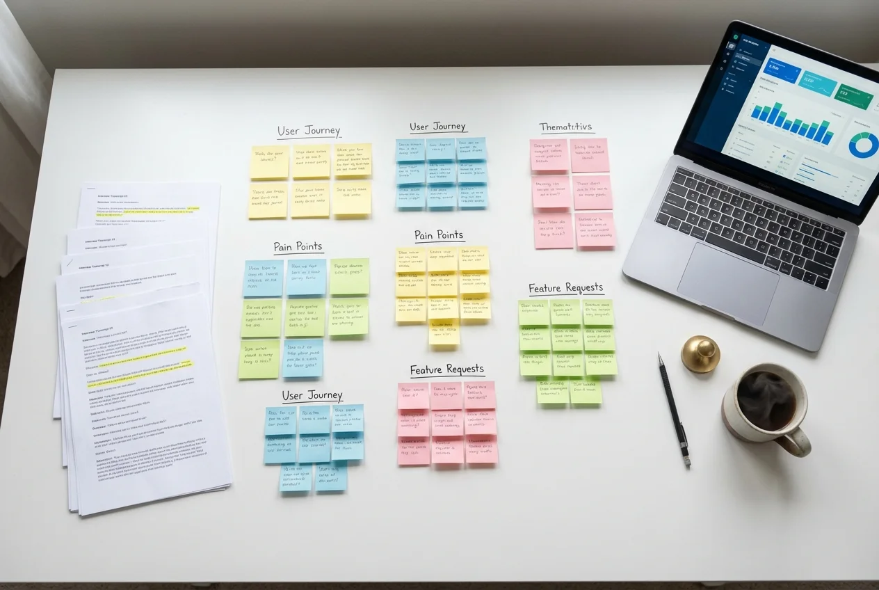 UX Research
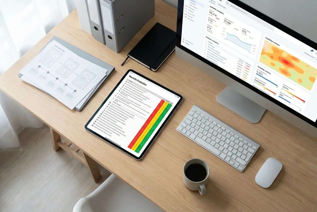 UX Audit
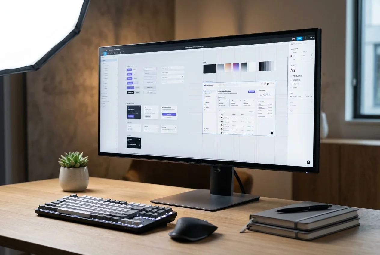 UI Design
 Prototyping & Wireframing
 UX Strategy
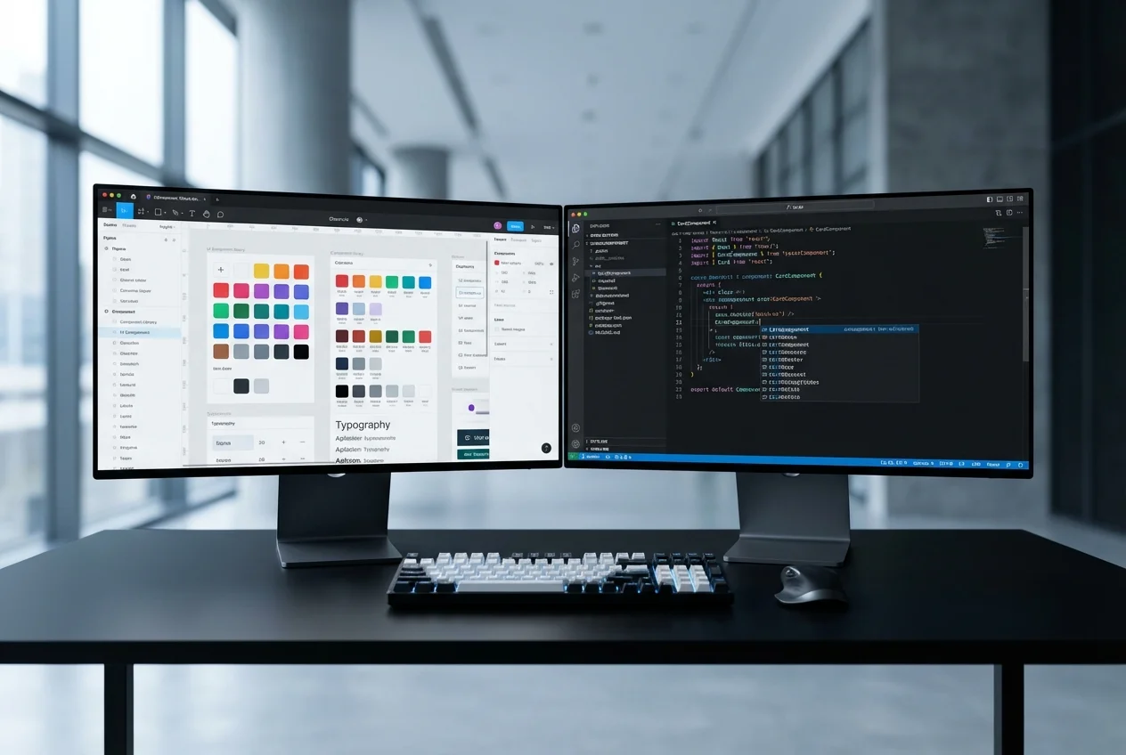 Figma to Code