Figma to Code: Design Handoff Experts Who Read Your Files Differently
Here is the problem most designers face: you hand off a meticulously structured Figma file to a development team and get back code that looks approximately right on one screen size. The auto-layout logic you spent hours perfecting is gone — replaced by hardcoded margins. Your carefully constructed component variants are rebuilt as separate, unrelated elements. Your design tokens exist nowhere in the codebase. The spacing is close but not precise, and nobody seems to have noticed that three interaction states are missing entirely.
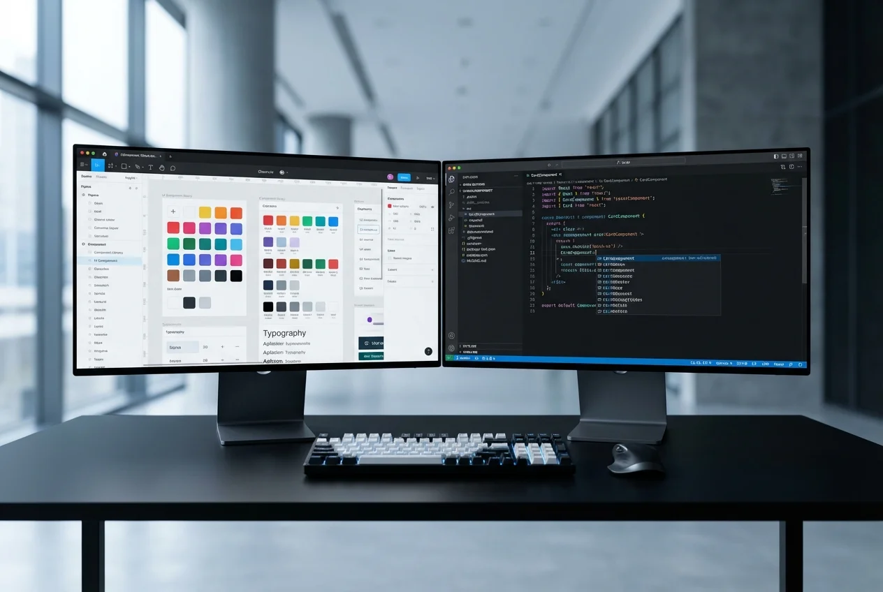
We built our Figma-to-code practice specifically to solve this problem. Not by being faster or cheaper than other developers, but by being genuinely literate in Figma's design model. We understand auto-layout nesting behaviour, how constraint-based resizing translates to CSS, why your component variant structure matters for code architecture, and what your token hierarchy tells us about maintainability. When we open your Figma file, we are reading it — not just looking at it.
How We Read Figma Files
Most developers use Figma's inspect panel to grab CSS values and rebuild layouts from visual reference. That approach produces code that matches the surface but misses the structure underneath. We take a fundamentally different approach.
- Auto-layout analysis: We trace your auto-layout tree from root to leaf, understanding how padding, gap, and alignment cascade through nested frames. This structure directly informs our CSS — using flexbox and gap properties that mirror your Figma layout logic, not arbitrary positioning that happens to look similar.
- Variant architecture: Your Figma component variants encode design decisions — size options, visual styles, interactive states. We map these directly to typed React props, preserving the decision tree your design team built. A Button with four size variants and three style variants stays one component in code, not twelve separate implementations.
- Token hierarchy: We extract your colour, typography, spacing, and shadow tokens and implement them as CSS custom properties or Tailwind configuration. Every value in the codebase references a token — never a hardcoded hex code or pixel value. When your design team updates a token in Figma, there is exactly one corresponding change in code.
- Responsive intent: We study how your designs adapt across breakpoints — not just which elements reflow, but how spacing scales, which elements transform or hide, and how your layout logic shifts. This means the responsive code reflects your specific design decisions, not generic media query patterns.
What Other Developers Miss
After years of converting Figma files to production code, we have a clear picture of the details that most development teams overlook — and that designers notice immediately when the build goes live.
- Spacing inconsistencies: A 24px gap in one section and a 20px gap in another that should be identical. These happen when developers eyeball spacing instead of reading token values. We catch them because we reference your spacing scale systematically.
- Missing interaction states: Hover, focus, active, disabled, loading, error — your Figma components may document all of these, but developers under time pressure often implement only default and hover. We treat every documented state as a requirement.
- Responsive gaps: The space between your defined breakpoints — what happens at 900px when your designs show 768px and 1024px? Most developers leave these gaps to chance. We test every increment and ensure the layout degrades intentionally, not accidentally.
- Typography scale drift: Line heights and letter-spacing values that quietly change between Figma and code, making text blocks feel subtly wrong even when the font size is correct. We match the full typographic specification, not just font-size and font-weight.
Our Design QA Process
Implementation without verification is guesswork. Our QA process treats your Figma file as the source of truth and validates the code against it rigorously.
- Overlay comparison: We screenshot the live implementation and overlay it against the Figma frame at matching viewport widths, checking for pixel-level alignment differences
- Responsive spot-checks: We test at every specified breakpoint and at intermediate widths to verify layout behaviour across the full viewport range
- State completeness audit: Every component is checked against its Figma variant list to confirm all states are implemented and styled correctly
- Token consistency review: We verify that every colour, spacing, and typography value in the code traces back to a design token — no orphaned values
- Accessibility verification: Semantic HTML, keyboard navigation, focus management, and screen reader behaviour are validated against the intent expressed in your designs
Who This Is For
You are a designer or design team that takes craft seriously. You have invested real effort in structuring your Figma files properly — naming layers, building a component library, defining tokens, specifying responsive behaviour. You have tried handing these files to developers before and been disappointed by the result. You want a development partner who treats your Figma specifications as binding requirements and who understands design systems well enough to implement them faithfully. If that describes your situation, we are the right team for this work.
Why UX Design Agency
We are designers who write code and developers who think in design systems. That dual perspective means we never simplify away the details that matter to your design team. We understand what auto-layout padding means for component spacing because we use it ourselves every day. We know why your token naming convention matters because we build token systems for our own projects. The code we deliver does not just visually resemble your designs — it structurally mirrors your Figma file, making future updates predictable and systematic rather than a game of find-and-replace.


 UX Research
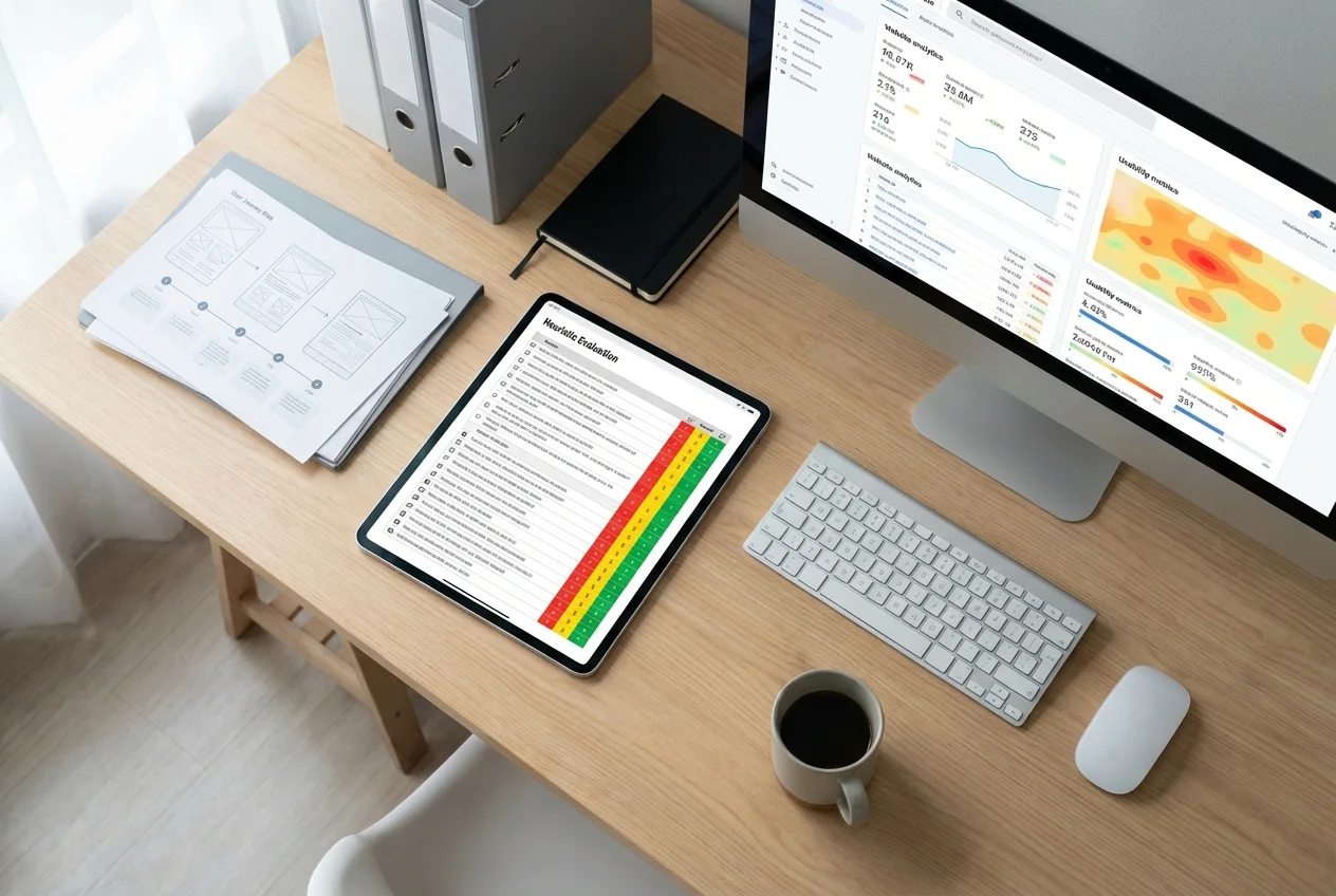 UX Audit
 UI Design
 Prototyping & Wireframing
 UX Strategy
 Frontend Development