Figma Design Tokens to CSS: 2026 Production Guide

The Gap Between Figma Tokens and Production CSS
Figma Variables changed the token landscape significantly when they launched in 2023. For the first time, designers could define structured, scoped, multi-mode tokens natively inside Figma — colours that switch between light and dark themes, spacing values that adapt between compact and comfortable density, typography that shifts between brand and product contexts. The design side of the token workflow improved dramatically.
The code side did not keep up. Most development teams still manually inspect Figma values, copy hex codes into CSS files, and approximate spacing by eyeballing the inspect panel. The systematic relationship between Figma tokens and code values — the entire point of having tokens — gets lost in this manual handoff. This guide covers how to extract tokens from Figma and implement them properly in CSS custom properties, Tailwind configuration, or JavaScript theme objects, preserving the structure and intent of your design token system.
Extracting Tokens from Figma
Figma Variables are organised into collections, each containing modes (such as Light and Dark, or Compact and Comfortable). Within each collection, variables are grouped and named hierarchically. A well-structured token system might have a "Primitives" collection with raw values and a "Semantic" collection that references primitives with meaningful names.
Extraction can be done manually for small token sets — export the variable values from Figma's Variables panel and transcribe them into your code format. For larger systems, plugins like Tokens Studio or the Figma Variables REST API allow automated extraction into JSON, which can then be transformed into any output format using tools like Style Dictionary. The JSON intermediate format looks like this:
{
  "color": {
    "text": {
      "primary": { "$value": "#1a1a1a", "$type": "color" },
      "secondary": { "$value": "#6b7280", "$type": "color" },
      "inverse": { "$value": "#ffffff", "$type": "color" }
    },
    "surface": {
      "default": { "$value": "#ffffff", "$type": "color" },
      "elevated": { "$value": "#f9fafb", "$type": "color" }
    }
  },
  "spacing": {
    "xs": { "$value": "4px", "$type": "dimension" },
    "sm": { "$value": "8px", "$type": "dimension" },
    "md": { "$value": "16px", "$type": "dimension" },
    "lg": { "$value": "24px", "$type": "dimension" },
    "xl": { "$value": "32px", "$type": "dimension" }
  }
}
Implementation: CSS Custom Properties
CSS custom properties are the most framework-agnostic approach. Define your tokens as variables on the :root selector, and reference them throughout your stylesheets. This approach works with any CSS methodology — vanilla CSS, CSS Modules, Sass, or PostCSS.
:root {
  --color-text-primary: #1a1a1a;
  --color-text-secondary: #6b7280;
  --color-surface-default: #ffffff;
  --color-surface-elevated: #f9fafb;
  --spacing-xs: 4px;
  --spacing-sm: 8px;
  --spacing-md: 16px;
  --spacing-lg: 24px;
  --font-size-body: 1rem;
  --font-size-heading-lg: 2rem;
  --line-height-body: 1.5;
  --shadow-sm: 0 1px 2px rgba(0, 0, 0, 0.05);
  --radius-md: 8px;
}

[data-theme="dark"] {
  --color-text-primary: #f9fafb;
  --color-text-secondary: #9ca3af;
  --color-surface-default: #111827;
  --color-surface-elevated: #1f2937;
}
The key advantage of CSS custom properties is native multi-mode support. Dark mode, high-contrast themes, and density variants all work by redefining the same variable names under different selectors. Your component CSS references var(--color-text-primary) everywhere, and the actual resolved value changes based on the active theme — exactly mirroring how Figma Variables work with modes.
Implementation: Tailwind CSS Configuration
If your project uses Tailwind, tokens should live in the Tailwind config rather than in separate CSS files. This makes tokens available as utility classes and ensures consistency between design tokens and the utility-first workflow.
// tailwind.config.ts
export default {
  theme: {
    colors: {
      text: {
        primary: 'var(--color-text-primary)',
        secondary: 'var(--color-text-secondary)',
      },
      surface: {
        DEFAULT: 'var(--color-surface-default)',
        elevated: 'var(--color-surface-elevated)',
      },
    },
    spacing: {
      xs: 'var(--spacing-xs)',
      sm: 'var(--spacing-sm)',
      md: 'var(--spacing-md)',
      lg: 'var(--spacing-lg)',
    },
    borderRadius: {
      md: 'var(--radius-md)',
    },
  },
};
Notice that the Tailwind config references CSS custom properties rather than hardcoded values. This hybrid approach gives you the best of both worlds: Tailwind's utility class workflow in your markup, and CSS custom properties handling theme switching at runtime without rebuilding CSS.
Typography Tokens: The Tricky Ones
Typography tokens are more complex than colour or spacing because a single type style in Figma encodes multiple CSS properties — font family, font size, font weight, line height, letter spacing, and sometimes text transform. Flattening these into individual CSS properties is straightforward but loses the grouped relationship. A more maintainable approach is to define typography presets that bundle related properties.
.text-body {
  font-family: var(--font-family-body);
  font-size: var(--font-size-body);
  line-height: var(--line-height-body);
  letter-spacing: var(--letter-spacing-body);
}

.text-heading-lg {
  font-family: var(--font-family-heading);
  font-size: var(--font-size-heading-lg);
  line-height: var(--line-height-heading);
  letter-spacing: var(--letter-spacing-heading);
  font-weight: 700;
}
Shadow and Border Radius Tokens
Shadows and border radii are often overlooked in token implementation, but they contribute significantly to visual consistency. Figma defines shadows with x-offset, y-offset, blur, spread, and colour — extract these as composite tokens. Border radius tokens are simpler but equally important for maintaining consistent roundedness across your component library. Define a radius scale that matches your Figma Variables and reference it in every component that uses rounded corners.
Keeping Tokens in Sync
The token workflow is only valuable if Figma and code stay synchronised. For small teams, a manual sync process with a documented token changelog works adequately. For larger teams or rapidly evolving design systems, consider automated pipelines: Figma Variables API extracts current token values on a schedule, a transform step converts them to your output format, and the result is committed to your repository as a pull request for review. This ensures that when a designer updates a token in Figma, the corresponding code change is generated automatically and reviewed before merging — closing the loop between design and development completely.
 UI Design
 Frontend Development
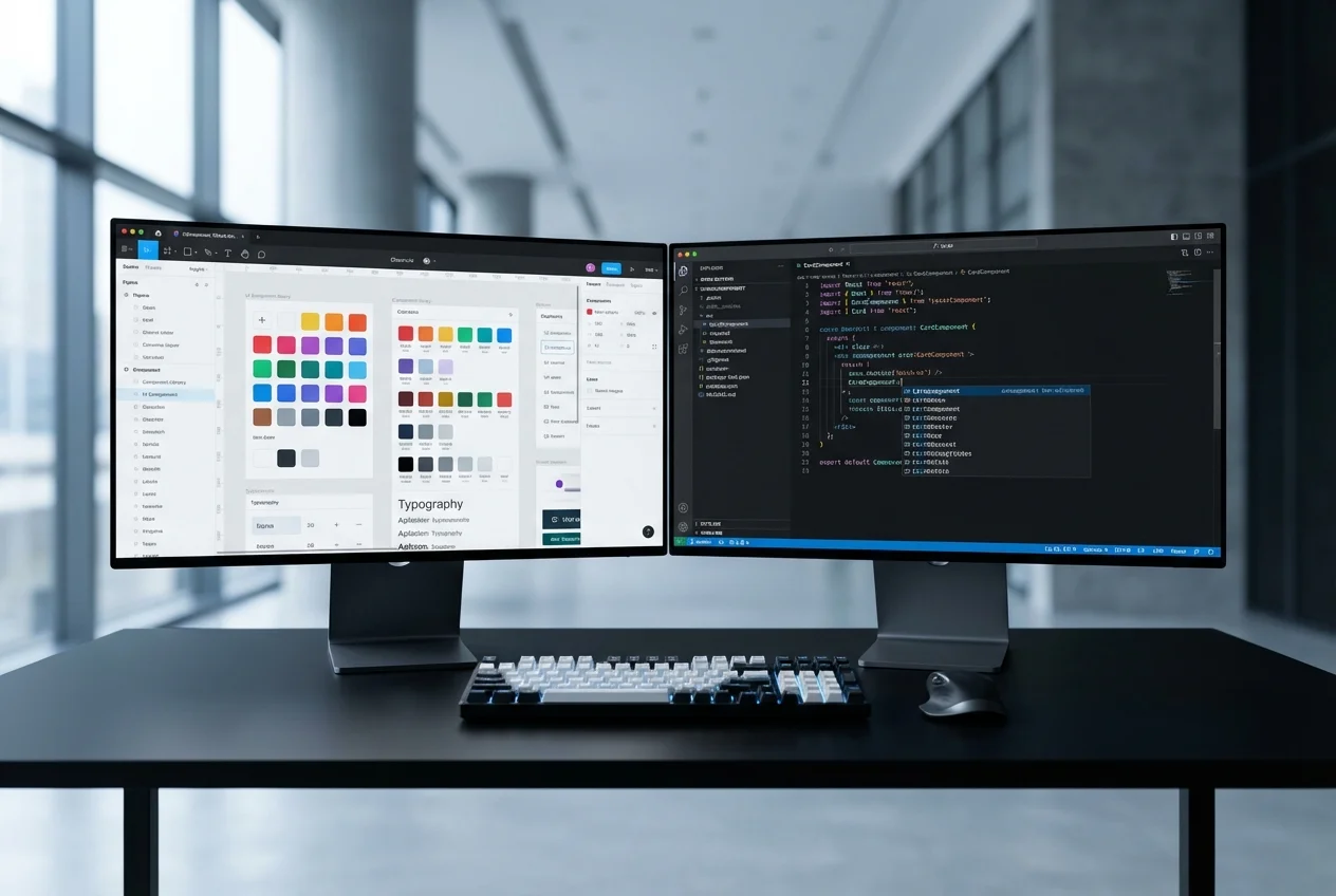 Figma to Code