B2B vs B2C UX Design — Why B2B SaaS Needs a Different Design Approach (2026)
Why B2B UX and B2C UX Are Not the Same Discipline
The single most expensive mistake we see UK product teams make is hiring a UX designer with a consumer background to lead a B2B SaaS engagement and assuming the patterns will transfer. They will not. B2B UX and B2C UX share a vocabulary — research, journeys, interaction design, conversion — but the underlying mechanics are fundamentally different. The user is rarely the buyer. The decision cycle is months, not minutes. The "session" is a workflow that spans days, not a transaction completed in seven seconds. The visual aesthetic is selected by procurement, not by the end user. Design choices that look conservative or unfinished in consumer terms are often the highest-conversion patterns in B2B because they match how B2B buyers actually evaluate software.
This guide is the practical framework we use when scoping B2B SaaS engagements at our UK UX design agency. It walks through the seven design dimensions where B2B and B2C diverge most dramatically, the patterns that work in each context, and the procurement mistakes that cost UK B2B SaaS teams six and seven figures a year in misallocated design spend.
Dimension 1: The Buyer Is Rarely the User
In B2C, the person who clicks "buy" is the person who will use the product. Their evaluation, payment, and usage live inside a single mental session. In B2B SaaS, the buyer is a head of department, a procurement lead, or a CFO; the user is a frontline operator who inherits the tool. Those two audiences have almost nothing in common. The buyer evaluates against compliance, integration, security, vendor stability, and pricing predictability. The user evaluates against workflow speed, error rate, and how much the tool gets in the way of doing the actual job.
Design implication: B2B SaaS marketing pages, sales-assist UI, and trial onboarding need to be designed for the buyer's evaluation framework, not the user's daily workflow. Pricing transparency, security certifications (SOC 2, ISO 27001, GDPR), integration logos, and named customer logos drive conversion in B2B in a way they do not in B2C. The product itself — the workflow surface the user touches every day — has to be designed for the user, on different principles entirely. Most B2B SaaS UX failures we audit at our UX audit service trace back to a design team that designed the entire product surface for one audience and got both wrong.
Dimension 2: Workflow Density Beats Whitespace
Consumer design orthodoxy in 2026 is whitespace-dense, one-action-per-screen, mobile-first. That orthodoxy is wrong for B2B SaaS workflow tools. A B2B user opens the tool to complete a specific task they have done 200 times that month — book a load, approve an invoice, configure a deployment, triage a ticket. They need every relevant data point and control on a single screen, organised by the structure of the task, not hidden behind progressive disclosure. Forcing a B2B user through a five-screen wizard for a task they perform daily is not "improving the UX." It is adding friction that the user will route around by opening five browser tabs or going back to Excel.
Design implication: B2B workflow UI is dense by design. Information density, multi-pane layouts, keyboard-first interaction, and inline editing are conversion patterns in B2B, not anti-patterns. The reference points are professional tools — Linear, Notion, Figma, Stripe Dashboard, Vercel — not consumer apps. A creative UX agency that has only shipped consumer work will instinctively reach for the wrong density patterns and the resulting product will feel "clean" to the design team and "slow" to the users who have to live in it eight hours a day. For a fuller breakdown of how this lands in practice, see our guide to interaction design for B2B SaaS conversion.
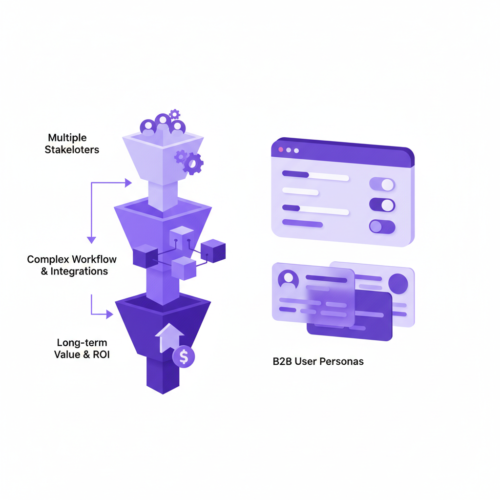
Dimension 3: Multi-Stakeholder Decisioning Shapes the Funnel
B2C conversion is a single-actor funnel — one person decides, one person pays. B2B SaaS conversion is a committee funnel — typically four to seven stakeholders touch a buying decision in mid-market SaaS, and ten to twenty in enterprise. The marketing site, the trial, the demo flow, the sales-assist UI, and the procurement pack all have to serve different audiences with different evidence at different moments in the cycle.
Design implication: B2B SaaS UX has to be designed funnel-stage by funnel-stage, with explicit attention to which stakeholder is in which mental state. The economic buyer needs ROI calculators and security pages early. The technical evaluator needs integration documentation and architecture diagrams in the middle. The end user needs a hands-on trial that proves the workflow works for their specific job in the final third. A B2B UX agency that treats the funnel as a single user journey — the consumer assumption — will under-serve at least two of those three audiences and the conversion math will quietly collapse. Our UX strategy practice sequences the design programme against the committee funnel explicitly, not against a generic "user journey."
Dimension 4: The Conversion Event Is Often an Email, Not a Click
B2C conversion is a button click — add to cart, sign up, subscribe. B2B SaaS conversion is rarely a click. It is a "talk to sales" form, a calendar booking, a security questionnaire response, or a procurement RFP. The conversion event happens off the website, in a sales cycle that lasts weeks or months. The website's job is not to close — it is to qualify, educate, and hand off a sales-ready lead with enough context that the sales conversation starts ten steps in, not at zero.
Design implication: B2B SaaS marketing UX is optimised for lead qualification and sales hand-off, not click-through-rate. The forms are longer, the gated content is more valuable, the demo-request flow asks more qualifying questions. A B2B website that uses consumer conversion patterns — short forms, friction-free signup, "no credit card required" — will generate volume but the leads will be unqualified and the sales team will burn cycles disqualifying. For a deeper view of how this lands in our own funnel design, see how we structure the free consultation flow for B2B B2B SaaS evaluators.
Dimension 5: Aesthetic Conservatism Is a Conversion Lever
The B2C design playbook of 2026 rewards distinctiveness, bold typography, expressive motion, and aesthetic risk-taking. The B2B SaaS design playbook rewards aesthetic familiarity. B2B buyers — particularly in financial services, healthcare, and enterprise — read "design boldness" as "vendor immaturity." The visual references they trust are Stripe, Notion, Atlassian, Salesforce, and Snowflake; the visual references they distrust are consumer-fashion-forward marketing pages from B2C-pedigree studios.
Design implication: B2B SaaS visual design has to be confident, polished, and quietly distinctive — not loud. The colour palette is usually a single accent against a neutral system. The typography is a readable workhorse, not a display showpiece. The motion is functional, not expressive. A creative UX agency that has only shipped consumer work will instinctively over-design the marketing surface and the conversion math will collapse against B2B evaluator expectations. Our creative UI/UX agency guide covers the broader pattern of how creative ambition has to be calibrated against buyer context.
Dimension 6: Onboarding Is Activation, Not Conversion
In B2C, onboarding is the last few seconds of the conversion funnel — get the user past sign-up to first action with minimum friction. In B2B SaaS, onboarding is a multi-week activation programme that determines whether the customer ever sees the value they were promised in the sales cycle. The "first session" might involve admin setup, team invitations, integration configuration, data import, and policy configuration — none of which a consumer designer would recognise as onboarding.
Design implication: B2B SaaS onboarding has to be designed as a sequenced activation programme with named milestones (admin set up → team invited → first data imported → first workflow completed → first weekly habit formed) and explicit measurement at each milestone. Activation rate, not signup rate, is the metric that determines retention. A consumer-pedigree designer will optimise the first 60 seconds of the experience; a B2B-pedigree designer will optimise the first 60 days. For the activation playbook in detail, our interaction design for B2B SaaS conversion guide walks through it sprint by sprint.
Dimension 7: Retention and Expansion Are the Real Revenue Game
B2C revenue is dominated by acquisition — the user pays once or signs a subscription and either churns or doesn't. B2B SaaS revenue is dominated by retention and expansion — the initial contract is often a small fraction of the customer's lifetime value, and the design choices that drive expansion (seats added, modules adopted, usage depth) compound over years. A B2B SaaS product designed only for new-user conversion will have a churning customer base and flat expansion revenue, regardless of how many leads the marketing site generates.
Design implication: B2B SaaS UX has to be designed for the "land and expand" arc, not just the "land" event. In-product upgrade prompts, feature discovery for the unused half of the product, admin tooling that makes seat expansion frictionless, and usage analytics that surface expansion opportunities to the customer's internal champion — these are design surfaces that consumer designers rarely think about and that determine 60–80% of B2B SaaS revenue. Our UX strategy service frames the design roadmap against activation, retention, and expansion metrics explicitly, because those are the metrics that drive B2B SaaS revenue.
What This Means for Hiring a B2B UX Agency
Three procurement implications follow from everything above. Check the portfolio for B2B SaaS specifically. "We have done B2B work" is not the same as "our practice is built for B2B SaaS." Ask for two shipped B2B SaaS engagements with named outcomes — activation lift, churn reduction, expansion seat growth — not just "improved user satisfaction." Check the methodology for funnel-stage thinking. A B2B-credible UX agency will talk in marketing funnel, sales funnel, activation funnel, retention funnel, and expansion funnel — not in "the user journey." If the agency uses consumer-funnel language, the engagement will under-serve at least two of the five funnels. Check the team for B2B SaaS senior leads. The strategist on the engagement needs to have personally shipped B2B SaaS work, not learned it on your account. The pattern recognition is not transferable from consumer.
For a wider view of how to evaluate UX design agencies in the UK against B2B-specific criteria, our guide to choosing the right UX design agency in the UK is the natural next read, and our UI/UX design agency UK guide covers the broader market context.
Where to Go Next
If you are scoping UX work for a UK B2B SaaS product, the most useful next step is a working conversation about your specific funnel — which stage is leaking value, and what design intervention would close the leak. Our senior UX practitioners will give you an honest read on whether the leak is acquisition-shaped, activation-shaped, retention-shaped, or expansion-shaped, and what a realistic engagement looks like for each. For most B2B SaaS teams, that 30-minute conversation surfaces the highest-ROI design investment for the next two quarters.
Book your free 45-minute B2B UX consultation with a senior UK UX strategist, or explore the full UX strategy service to see how we sequence B2B SaaS design programmes against the activation-retention-expansion arc.
 UX Research
 UX Audit
 UI Design