Mobile UX Design Best Practices for 2025

Mobile Is the Default. Design Like It.
We've been talking about the shift to mobile for over a decade. In 2025, it's not a shift — it's the reality. Over 60% of global web traffic comes from mobile devices. For many consumer products, that number is closer to 75–80%. App-first products are, by definition, mobile-first.
Yet in our UX audit work, we still regularly encounter products where the mobile experience is clearly an afterthought — desktop designs squeezed into smaller screens, touch targets too small for human fingers, and layouts that seem to have forgotten that mobile users are often in motion, distracted, and using one thumb.
This guide covers the mobile UX design practices that consistently separate excellent mobile experiences from frustrating ones — based on our experience across dozens of mobile UX projects and the latest research on mobile user behaviour.
1. Design for the Thumb Zone First
Steven Hoober's research on how people hold and interact with phones — and the subsequent work that's built on it — consistently shows that most one-handed mobile use involves the thumb as the primary input mechanism. The thumb has a natural range of reach that defines what's "easy", "awkward", and "difficult" to reach on a screen.
For a right-handed user holding a phone one-handed (the most common scenario), the bottom-right area of the screen is the easiest to reach. The top corners are the hardest. This has direct implications for where you put primary actions — they should be in the thumb-friendly zone, not at the top of the screen where they're only reachable with a stretch or a two-handed grip.
In practice: Place primary CTAs and navigation in the lower portion of the screen. Consider bottom navigation bars over hamburger menus hidden at the top. Put frequently used actions within comfortable thumb reach. Reserve the top of the screen for secondary actions, search, and settings.
2. Make Touch Targets Large Enough
Apple's Human Interface Guidelines specify a minimum tap target size of 44x44 points. Google's Material Design guidelines suggest 48x48dp. In our audits, we regularly find critical interactive elements — links, icons, small buttons — well below these minimums, often because the design was originally created at desktop scale without accounting for touch interaction.
Small touch targets don't just cause accidental taps on adjacent elements; they create hesitation. Users slow down when they're not sure they'll hit the right target, which adds friction and mental effort to every interaction. On forms, small targets increase input errors. In navigation, they increase accidental navigation to the wrong screen.
In practice: In Figma, set a visual guide for minimum tap target size and check all interactive elements against it. For icon-only buttons, add invisible padding around the icon to bring the total tap target to the recommended size without affecting the visual design.
3. Reduce Cognitive Load Relentlessly
Mobile users are context-switching constantly — checking an app while in a queue, during a commute, in a meeting break. They have less focused attention available than desktop users. This means mobile UX has a lower tolerance for cognitive complexity than desktop.
Cognitive load in mobile UX shows up in: interfaces with too many options visible simultaneously, form flows that ask too much too soon, navigation structures that require users to remember where they are, and content that requires sustained reading to parse. Each of these has a mobile-specific solution.
In practice: Apply progressive disclosure — show users only what they need right now, reveal additional complexity as they request it. Break long forms into single-question steps rather than showing all fields at once. Use clear visual hierarchy to guide attention so users don't have to work out what to look at first. Keep text scannable with clear headings and short paragraphs.
4. Design for Interruption
Mobile sessions are frequently interrupted — a phone call comes in, a notification appears, the user pockets their phone mid-task. This means mobile UX needs to handle incomplete states and resumption gracefully in ways that desktop experiences typically don't have to worry about.
A user who gets interrupted partway through a checkout and returns 20 minutes later should find their cart exactly as they left it, ideally with an indication of where they got to. A user who starts a form, gets a call, and returns shouldn't have to start from the beginning. A user who navigates away and back should land where they left off, not at the app home screen.
In practice: Design and build persistence into key user flows. Save form progress locally or to the session. Show clear progress indicators so users can see how far they've come. Design "welcome back" states that re-orient users who return after a break.
5. Optimise for One-Handed Use
The data on one-handed mobile phone use is consistent: the majority of mobile interactions happen with one hand, most commonly the dominant hand holding the phone with the thumb doing the work. This affects interaction design in several specific ways.
Swiping gestures are natural and fast in mobile UX — swiping right to go back (as on iOS), swiping to reveal actions on list items, swiping through carousels. These gestures feel natural because they map to natural thumb movement. Reaching to the top of the screen to tap a button does not.
At the same time, gesture-only interactions without visible affordances are a UX risk — users need to be able to discover what gestures are available. The solution is to design visible affordances while also supporting intuitive gestures for users who discover them.
In practice: Design primary user flows to work with one thumb. Support standard swipe gestures where they're expected by the platform (back navigation, swipe-to-delete, pull-to-refresh). Avoid placing critical controls at the very top of tall screens.
6. Treat Loading and Skeleton States as UX Design Problems
Mobile networks are slower and less reliable than broadband. Users expect some loading delay — but they need feedback that something is happening. A blank screen while content loads is indistinguishable from a crash, and users will interpret it as such.
Skeleton screens — placeholder layouts that show the content structure before the content loads — dramatically outperform spinner animations in user satisfaction. They set expectations, show that the product is working, and reduce perceived wait time. When content loads into a skeleton, the transition is smooth rather than jarring.
Error states on mobile also need specific design attention. A failed network request on mobile is not unusual — it happens when users go through a tunnel or walk into a building with poor signal. The error state needs to clearly explain what went wrong, indicate whether the user's work was saved, and offer a simple path to retry.
In practice: Design skeleton screens for all data-loading states. Design clear, friendly error states that offer recovery actions. Test your product on a throttled mobile connection (Chrome DevTools allows this) to experience what most mobile users experience.
7. Make Text Readable Without Zooming
This is basic but violated constantly: body text on mobile should never require the user to zoom in. The recommended minimum font size for body text is 16px (or 1rem). Below 14px is generally inaccessible for users with typical vision. Below 12px is small enough to create accessibility issues for the majority of users.
The problem usually originates in desktop-first design, where body text at 14px or 15px looks perfectly readable on a large monitor. When that design gets squeezed to mobile screen width without increasing the text size, it becomes uncomfortably small.
In practice: Set your mobile body text minimum at 16px and stick to it. Use line heights of 1.4–1.6 for body text. Keep line length to 45–75 characters for comfortable reading on mobile — this often means constraining the content column width rather than letting text run full-width on tablet-sized screens.
8. Design for Offline and Low Connectivity
Progressive Web Apps and native apps that work offline, or gracefully degrade on poor connections, provide significantly better user experiences than ones that simply fail. This is a design consideration as much as a technical one — what state does the app show when offline? What functionality is still available? What data should be cached locally?
For apps where offline use is core to the value proposition (note-taking apps, task managers, music apps), this is obviously critical. But even apps where offline use isn't the primary scenario benefit from graceful degradation — a user who briefly loses signal shouldn't lose their work or see a broken interface.
In practice: Map your critical user flows and decide which ones should work offline. Design clear, specific messaging for offline states. Implement optimistic UI updates — show the result of an action immediately in the UI while the network request happens in the background, so users aren't waiting for server confirmation before seeing feedback.
9. Test on Real Devices, Not Just Emulators
Browser-based device emulators are useful for basic responsive design checking, but they don't replicate the real mobile experience. Touch response, scrolling physics, performance, and the system-level chrome (status bar, home indicator, notches) all behave differently on real hardware. Designs that look great in a browser emulator regularly surface problems when tested on real devices.
The most important testing surface is mid-range Android devices — not the latest flagship, but the kind of device that a significant portion of your users actually have. These devices have less processing power, smaller screens, and sometimes older operating systems that affect how CSS and JavaScript behave.
In practice: Maintain a small library of real devices for testing — at minimum, a current iOS device, a mid-range Android, and an older Android. Test key user flows on these devices at multiple points in the design and build process.
10. Measure What Mobile UX Is Actually Doing
Finally: instrument your mobile product well enough to understand what's happening. Mobile-specific analytics should tell you: where users are dropping off in key flows, what the most common tap errors are (tapping near a target but not on it), how long tasks are taking on mobile versus desktop, and what screens generate the most back-navigation.
Heatmaps and session recordings on mobile (using tools like Hotjar or FullStory) reveal behaviour patterns that analytics alone won't show — where users are scrolling to, whether they're engaging with elements they're not supposed to (users tap static elements that look interactive), and how far down the page they typically read before leaving.
The best mobile UX improvement programmes run continuously: measure, identify friction, design a fix, test it, ship it, measure the impact, and repeat. This compound improvement process over time is what separates digital products that get better and better from ones that plateau and decline.
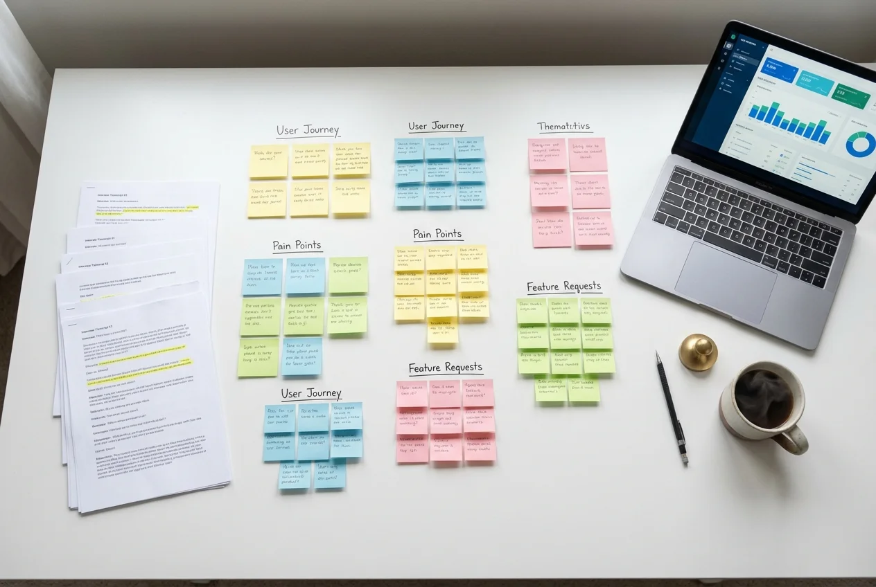 UX Research
 UX Audit
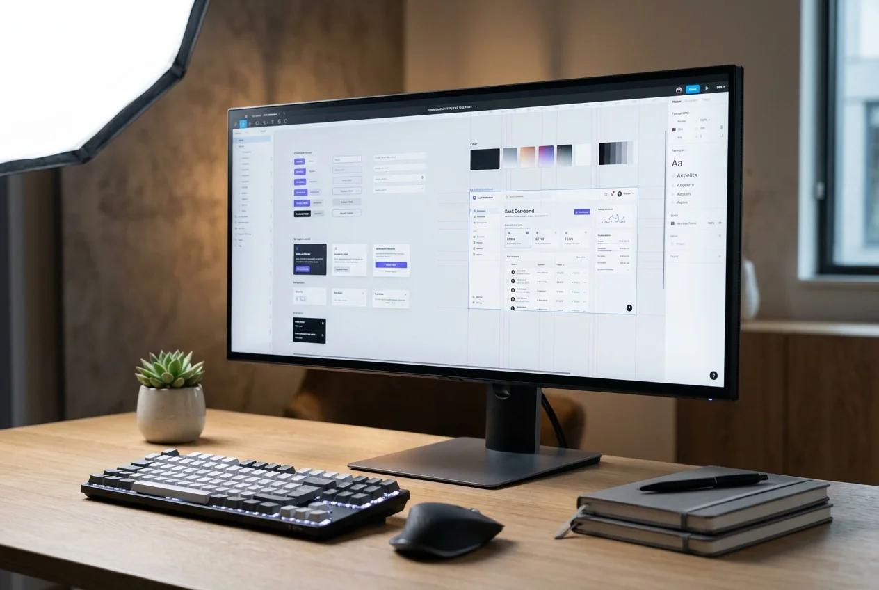 UI Design