B2B Navigation UX: Information Architecture Patterns for SaaS Products

Why B2B navigation UX is harder than it looks
B2B navigation has to serve admins, daily operators, finance approvers and executives inside one product. Each role has different goals, so a menu built around your org chart or your feature list quickly becomes a maze. Poor B2B navigation UX shows up as low feature adoption, support tickets that start with "where do I find...", and trials that never reach the first value moment.
Good information architecture is one of the cheapest levers on B2B conversion rate, because it removes friction between a user and the task they came to do. It is also a core part of our UX strategy work for SaaS teams.
Five navigation patterns that work in B2B SaaS
1. Task-based primary navigation
Label items by what users want to achieve ("Reports", "Customers", "Billing") rather than internal module names. Run a card sort with real users before you finalise labels.
2. Role-aware menus
Hide what a role cannot use. Showing an operator six admin-only items adds noise and increases mis-clicks. Keep one consistent structure so support and training stay simple.
3. Global search and command palette
Once a product passes about 30 screens, search becomes a primary navigation method. A command palette (Cmd+K) gives power users a fast route and shortens time to key actions.
4. Progressive disclosure
Show the top 5 to 7 destinations and group the rest. Secondary items can live in a collapsible section, a settings area or contextual menus.
5. Clear wayfinding
Breadcrumbs, active states, page titles and consistent back behaviour tell users where they are. This matters most in deep workflows such as configuration or approvals.
How to audit your current B2B navigation
- Tree testing: ask 15 to 20 users to find specific items in a text-only menu. Aim for at least 80% success.
- Analytics review: look for pages reached only via search, high back-button use and rarely clicked top-level items.
- Support ticket tagging: count "can't find" requests by feature.
- Session recordings: watch where new users hesitate in their first session.
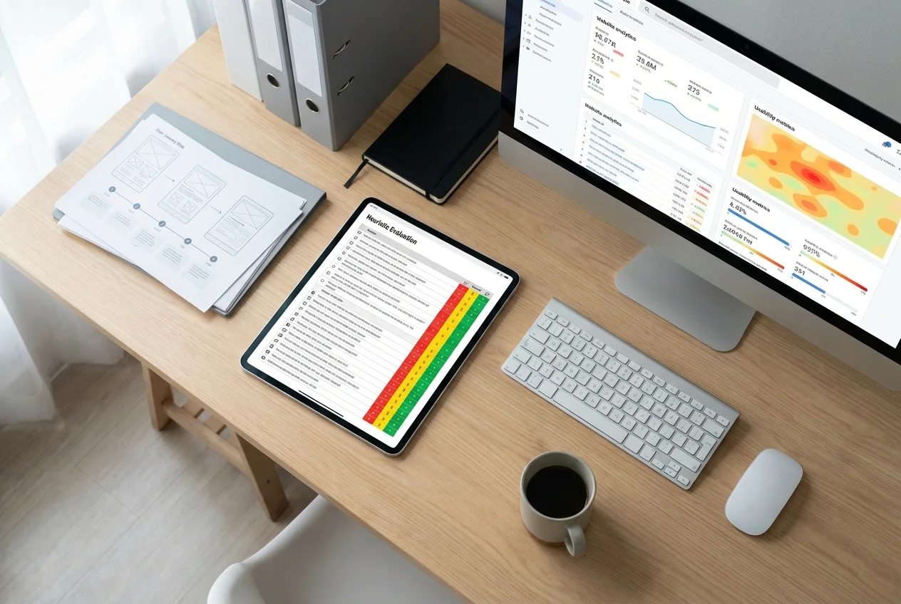
If you want an outside view, a structured UX audit will surface these issues in two to three weeks. Our signup funnel audit guide shows the same method applied to onboarding.
Navigation and B2B conversion rate
Navigation affects conversion at two points. On the marketing site, a clear structure sends buyers to pricing, case studies and the contact form. Inside the product, it shortens the path to activation. Teams that simplify both typically see better trial-to-paid rates and fewer abandoned onboarding sessions. For the interaction side of this, read how interaction design improves B2B SaaS conversion.
Common B2B navigation mistakes
- Mirroring internal team structure in the menu.
- Adding a top-level item for every new feature release.
- Using different labels in the menu, page titles and documentation.
- Ignoring mobile and tablet use for field or approval roles.
- Redesigning navigation without a migration plan, which breaks muscle memory for existing customers.
A simple redesign process
- Inventory every screen and feature.
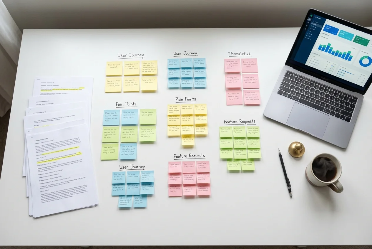
- Run a card sort and interviews per user role.
- Prototype two structures and tree-test both.
- Release behind a flag to a small customer group and measure task time and support tickets.
- Roll out with in-app guidance and a changelog.
FAQ
What is B2B navigation UX?
It is the design of menus, labels, search and wayfinding in business software so that users with different roles can complete tasks quickly and with confidence.
How many items should a B2B SaaS main menu have?
Aim for five to seven top-level items. Group related features beneath them and rely on search for the long tail.
Does navigation really affect B2B conversion rate?
Yes. Clear structure reduces drop-off before activation and helps marketing-site visitors reach pricing and contact pages, both of which feed conversion.
Struggling with a product people cannot navigate? Our UX research and design team can help. Book a free consultation to scope a navigation review.
 UX Research
 UX Audit
 UI Design