How to Prepare Your Figma Files for Perfect Code Handoff

What Developers Actually See When They Open Your Figma File
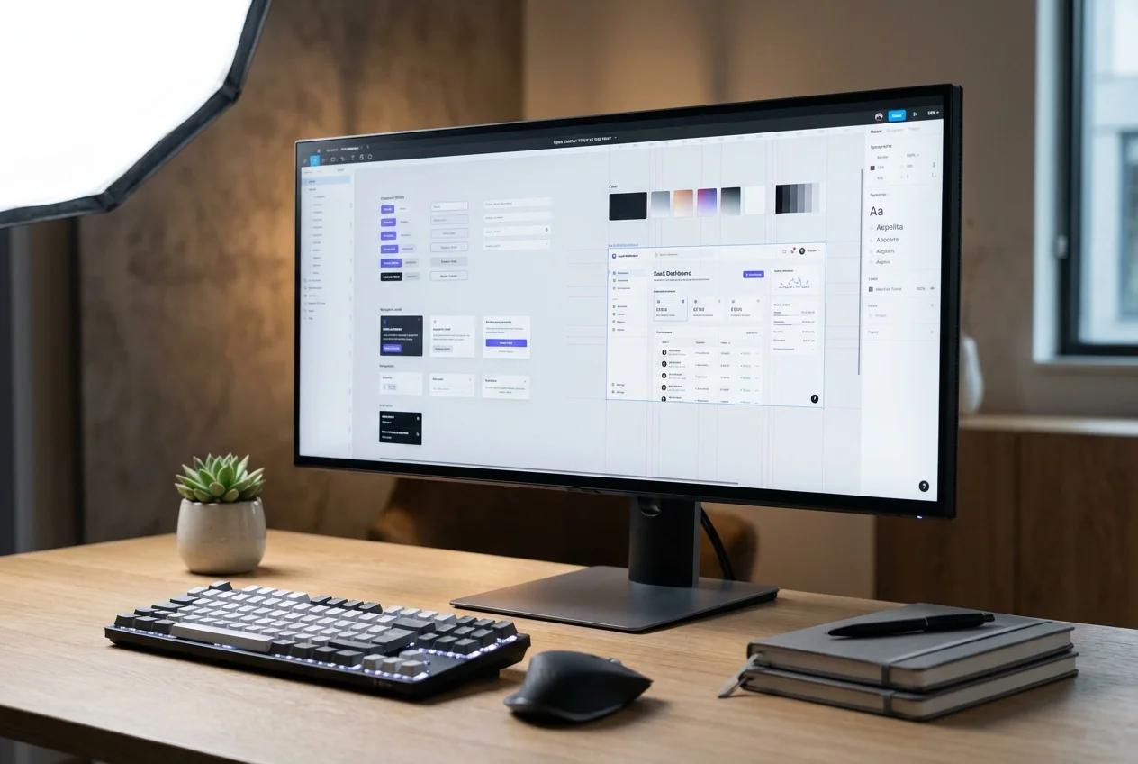
Designers spend weeks crafting beautiful, functional interfaces in Figma. Then the file gets handed to a developer, and the first thing they do is open the layers panel. What they find there determines whether the next three weeks will be productive or miserable. A file with layers named "Frame 437", "Group 12", and "Rectangle 89" tells the developer nothing. A file with layers named "hero/cta-button/primary", "card/header/title", and "nav/menu-item/active" tells them everything.
This guide is written from the developer's chair. After converting hundreds of Figma files to production code, we know exactly what makes handoff seamless and what creates friction, rework, and misalignment. If you follow these practices, the code your developers write will be structurally closer to your design intent — and both sides will spend less time in clarification meetings.
Naming Conventions That Save Hours
Layer names become CSS class names, component names, and variable identifiers in code. When layers are unnamed, developers invent names — and those invented names rarely match the design team's mental model. Establish a naming convention early and apply it consistently.
Use forward-slash hierarchy for component variants: button/primary/large, button/secondary/small. Name frames by their purpose, not their appearance: "pricing-section" rather than "blue-background-area". Name boolean properties descriptively: "hasIcon" and "isDisabled" rather than "Property 1" and "Property 2". Every layer a developer needs to inspect should have a human-readable name that communicates its role in the interface.
Auto-Layout: The Most Important Habit
Auto-layout is the single most impactful thing you can do for developer handoff. When a frame uses auto-layout, it directly communicates its CSS equivalent — flexbox direction, gap, padding, alignment, and distribution. When a frame uses absolute positioning with manually placed elements, the developer has to reverse-engineer the layout logic from visual position alone.
Build every frame with auto-layout from the root down. Set explicit padding and gap values rather than relying on visual spacing. Use "hug contents" and "fill container" intentionally — these map directly to CSS width behaviours. When you nest auto-layout frames, you are building a layout tree that a developer can translate to CSS almost mechanically. When you skip auto-layout and place elements by hand, you are forcing the developer to guess at the structural relationships between elements.
Component Structure That Translates to Code
Your Figma component library is, in effect, a specification for a React component library. The better your components are structured, the closer the code will be to your intent. Each component should have clearly defined variants using Figma's component properties — not separate, unlinked components for each state. Boolean properties should control visibility of optional elements like icons, badges, or helper text. Instance swap properties should define which child components can be substituted. Size variants should use consistent naming that maps to a predictable scale.
Think about your components the way a developer will consume them: a Card component with props for size, variant, hasImage, and hasFooter is clean and predictable. Five separate Card components named "Card with image", "Card without image", "Card small", "Card large", and "Card featured" is ambiguous and leads to five separate React components instead of one.
Token Documentation That Prevents Drift
Design tokens — colours, typography, spacing, shadows, border radii — are the connective tissue between your design and the codebase. If these are not explicitly defined and documented, developers will approximate values by eyeballing them from the inspect panel. The result is a codebase full of hardcoded values that look right today but drift as soon as anything changes.
Use Figma Variables (or Styles if you have not migrated to Variables yet) for every repeating value. Define a spacing scale and apply it consistently — if your scale is 4, 8, 12, 16, 24, 32, 48, never use 15 or 22 unless it is a deliberate exception. Document your colour tokens with semantic names: "text-primary", "surface-elevated", "border-subtle" rather than "gray-700" or "blue-500". The semantic name tells the developer what the colour means, not just what it looks like — and that meaning is what prevents incorrect substitutions in code.
What to Annotate
Figma's visual output does not communicate everything a developer needs. Certain design decisions are invisible in the static frame and need explicit annotation. Interaction behaviour: what happens on hover, focus, and click? Where do transitions occur and what easing should they use? Responsive rules: what changes at each breakpoint? Does this element reorder, hide, or transform? Content limits: what is the maximum character count for this heading before it wraps? What happens when a list has zero items versus fifty? Edge cases: what does the empty state look like? The error state? The loading state? These are the details that developers will either implement correctly because you told them, or implement wrong because they had to guess.
The Handoff Checklist
Before you send your file to development, verify these items. All layers are named descriptively. All layouts use auto-layout with explicit padding and gap. All repeating values use Variables or Styles. All component variants are defined using component properties. All interaction states (hover, active, disabled, loading, error) are documented. Responsive behaviour at each breakpoint is specified. Edge cases and content limits are annotated. If you can check every item on this list, your developers will thank you — and the code they deliver will be meaningfully closer to what you designed.
 UI Design
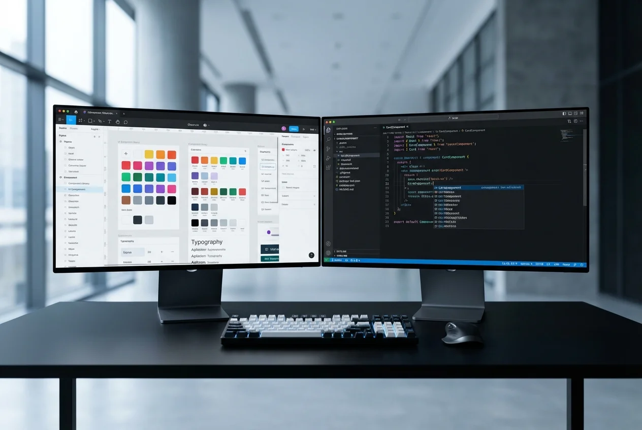 Figma to Code